Graphical View of Service State Distribution
Objective: Gain an understanding of how to view Graphical representation of Service State Distribution.
Transformed imported data can be viewed as a Spider Chart or Pie Chart, by clicking the appropriately labeled buttons. This can be used in the preparation of Asset Management Plans to show the current health of agency assets. The state distribution can be viewed either by asset quantity or asset network measure.
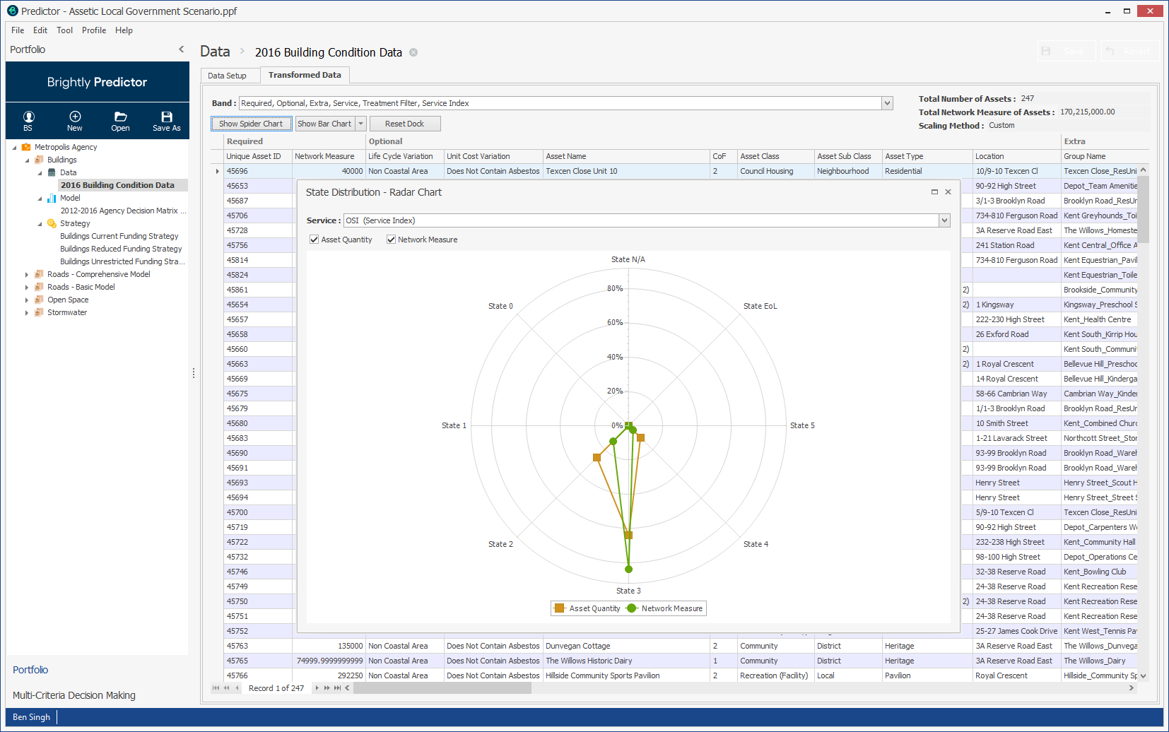
Difference criteria to display can be selected in the 'Service' dropdown. Users can copy or export these graphs by right clicking and selecting the appropriate function. Click the Reset Dock button to clear the charts.